EMLES

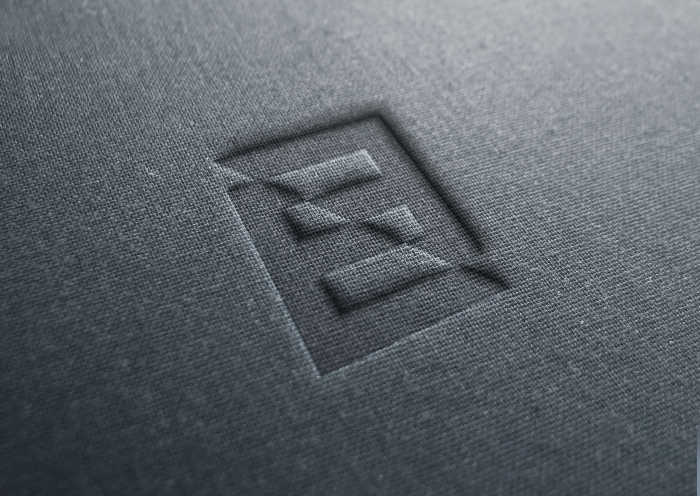
Emles, a new asset management company, was in need of a total brand identity. I designed the final logo design, using the creative strategy that was established by the visual project lead. The icon is made of two offset, mirrored E’s to tie in with the unique company name. The alignment and overlap between the horizontal bars of the E’s is meant to signify a lock and key, representing the ability for Emles to unlock investment opportunities, while navigating shifts in the market. A more traditional yet modern serif typography conveys an established and trustworthy company.


