LIQUIDIA

Liquidia, a biopharma technologies company, wanted to modernize their logo and build a more distinct brand identity that highlighted their innovative technology. Inspired by their distinct particle shapes, I designed the logo to incorporate multiple geometric shapes similar to those they use for their particles. A strong, yet simple icon speaks to the precision, scalability, and control behind the company’s products.

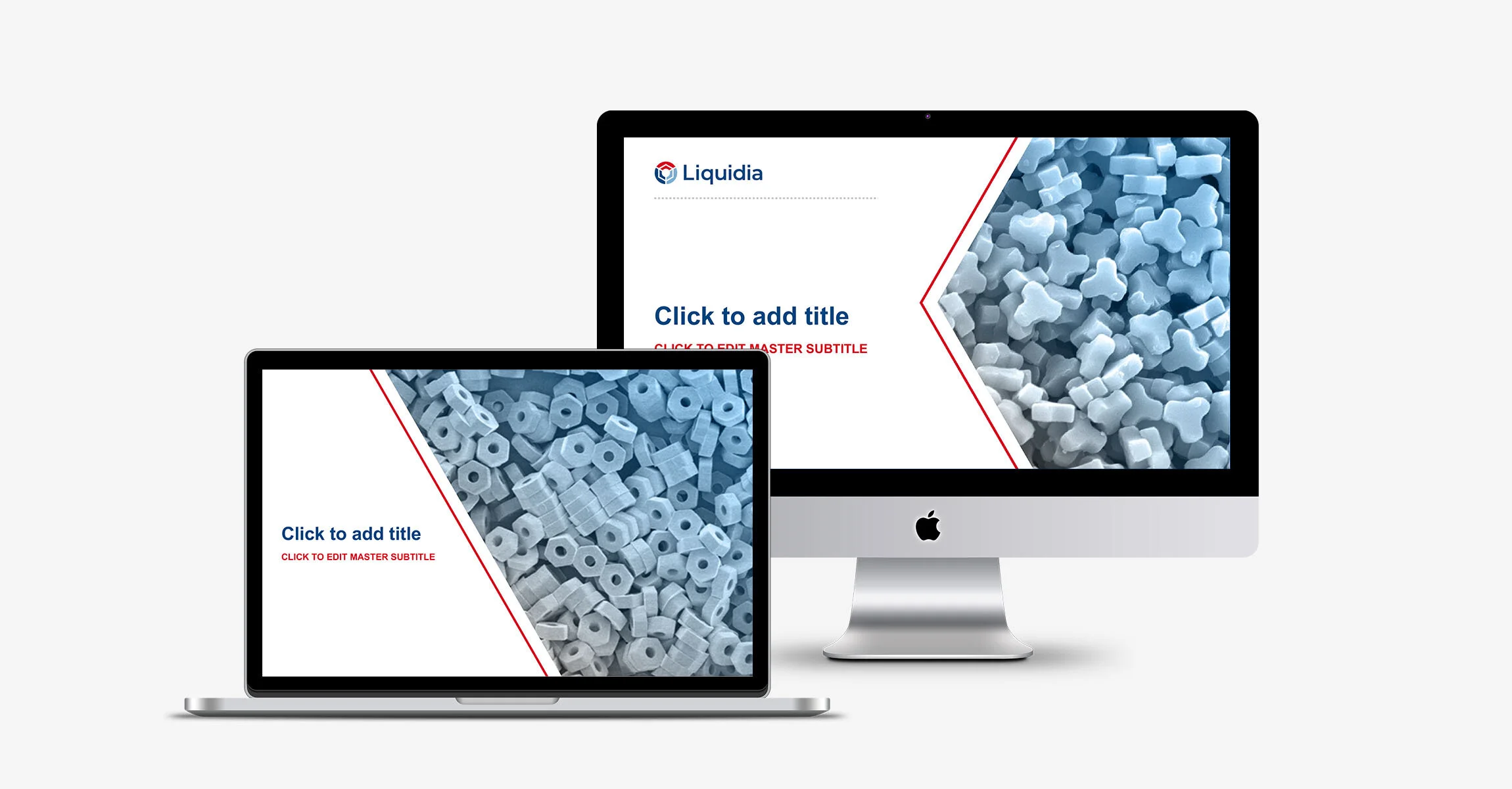


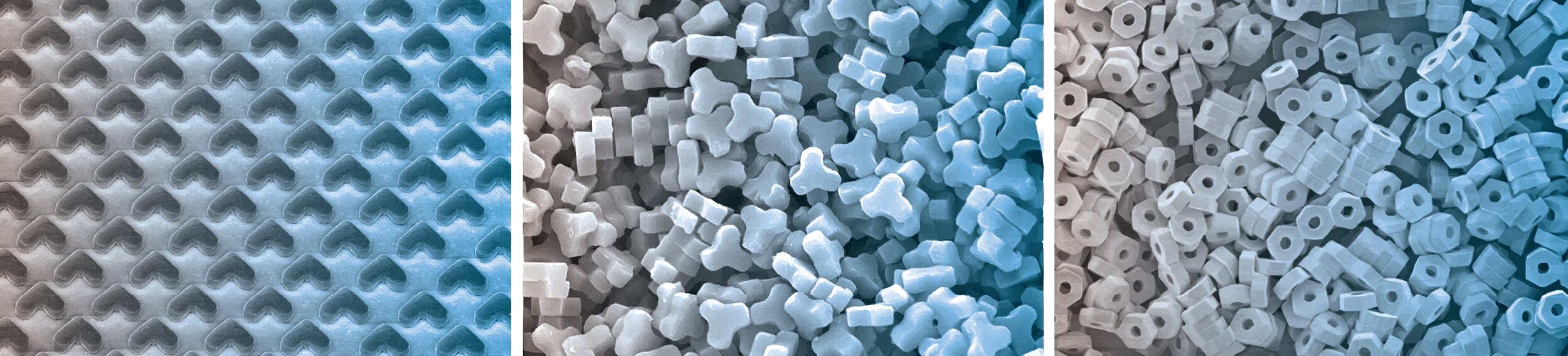
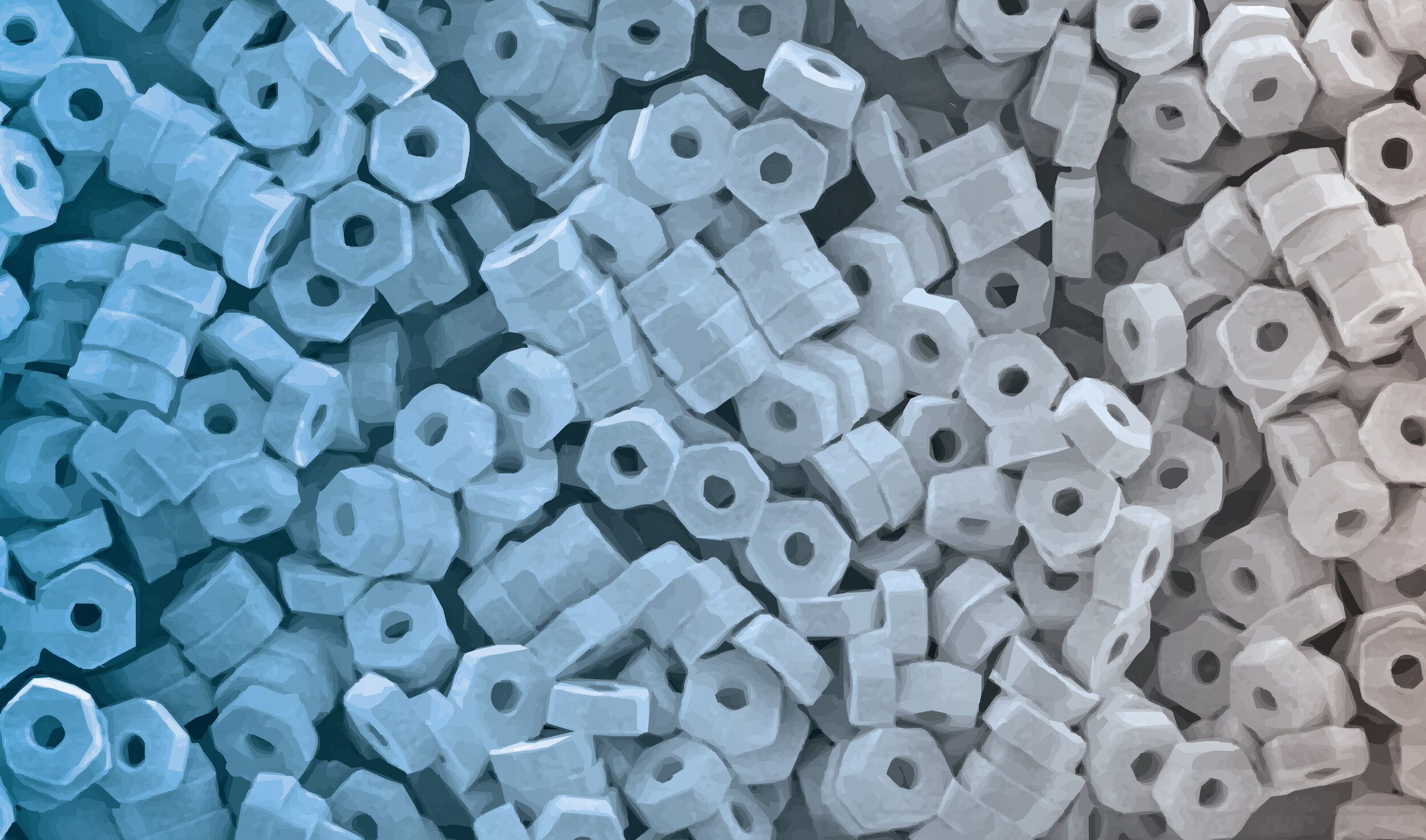
Liquidia’s unique technology for drug particles with precise, three-dimensional geometric shapes was something I wanted to highlight and use as an instant recognizable brand element. The microscopic images inspired the visual identity system and created something distinct and authentic to the Liquidia brand that I carried through a variety of materials including business cards, website, promotional banners, and presentation templates.